 I was running errands today, and had library books to return. It is a large system, but my nearest branch is only open 4 hours a day, 4 days a week. But which days and when? I pulled the car over and checked their website on my phone. They didn’t have a mobile adapted site so I had to wait to download the entire homepage, and then struggle to read the tiny print that listed each branch, each address, and their hours. Even when I blew up the page I still had trouble hitting the link with my finger to find their hours. Ok. I didn’t get irritated–I’m lucky the library has the money to even buy new books—I don’t expect them to build a mobile site. But my expectations from a business enterprise are a lot higher.
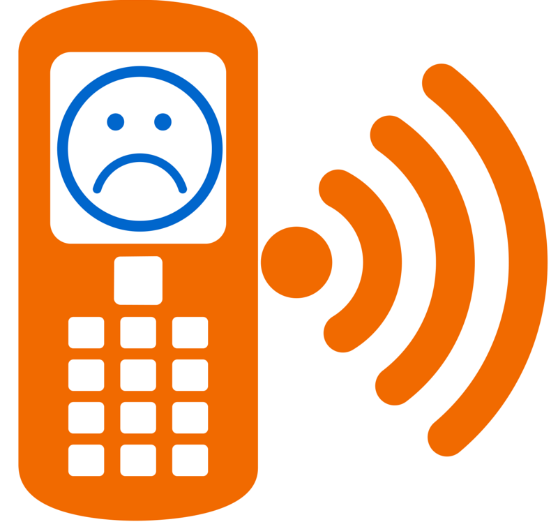
Todays’ question: have you done a search and then visited a website from your mobile phone? If the website you visited was designed solely to be viewed on a spacious laptop or desktop screen, I bet you gave up quickly and moved to the next search pick.
Sites not designed for the screen of a phone are websites asking to be ignored.
Simply put, the average home page designed for a large screen has too much information, too many buttons, pictures and links to be usable on a screen the size of a cigarette pack.
In future MSP Advantage blogs, I’ll talk about different issues you should address as you pare down your site for the “mobile experience,” but today let’s talk about how people read websites on a large screen vs. how they read them on a mobile device.
People do not read (nor do we design) webpages to be read like a newspaper. As viewers, we scan them, bouncing around here and there, driven by what catches our eye or interests. It isn’t a “linear” experience. (I once read a quip that people bounce through websites like caffeine-crazed squirrels.) Web designers put in movies, links, flashing words–any number of sparkly things to attract attention. And that can make for a pretty cool experience—on a laptop.
When we go to a mobile phone, we get off the caffeine high. The small screen makes us focus on quickly finding the core information we want. And we tend to only scroll vertically. No eyes roaming up, down, right, left, and diagonally. You need to keep this in mind as you pare down your website for mobile. The usual design ideas don’t work.
What that means is you will need to determine what the absolute core pieces of information you expect people are seeking when they visit, and make those clear, brief, and readable. In a sense, you need to put your webpages on a very strict diet. (Only the most nutritious food makes it to the plate) You need to make sure only the most important information appears front and center. Easily found and read. Clear links, big enough to be fat-fingered. And the core information about your product or service..