Answering The Question, “What Do I Want A Contact To Do As A Result Of Reading My Content?
Contributed by – Laura Estes
Call to Action or CTA play a key role in enhancing the effectiveness of your MSP marketing content. It is the button on a MSP marketing asset such as an ad, landing page or an email where the visitor is to take an action such as purchasing something (Buy Now), sign up (Register Now) or learn more (Download Now) which ideally will lead to a conversion.

Make a CTA that matters
In English class, the teacher often preaches writers to answer “So what? Who cares?” in their work. The same applies when you are creating a call to action for your MSP marketing assets. You should always be designing a call to action with the questions “So what? Who cares?” in mind. The ideal CTA will tell them exactly what they’ll get once they’ve clicked the button.
Your audience will be thinking:
Why should I click? What’s in it for me? Why should I want to do “x?”
So make sure you make it clear.
Here are some examples to help you think of a CTA meant to get you conversions!
Example #1: Be Unique
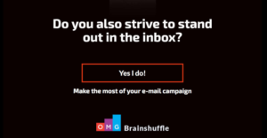
If you want them to sign up for your services, don’t just use “submit.” Add some flare to get their attention. Instead, try this:

The contact knows exactly what they are getting when they hit your CTA: It is clear, enticing and creative.
Example #2: Be clear
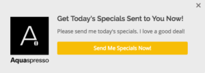
It’s important your CTA is not just creative but it must also be CLEAR about what they get by clicking the button. This example gives a timely and exciting call to the reader.

Example #3: Give them a reason to act
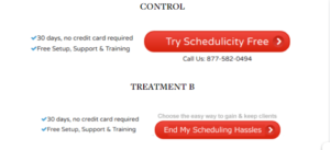
Answer their question “What’s in it for me? So what? Who cares?” Notice “Treatment B” prompts a stronger reaction.

Summary
Designing an effective call to action is an amalgamation of a variety of techniques, many of which we didn’t cover in this blog (location, color).
However, a great first step to designing your CTA is to make sure it answers the question “So what?” or “What’s in it for me?” for your readers. The goal is to make sure that your contact is enticed by the result of clicking the CTA. You can achieve this by thinking of a unique way to phrase it (think beyond “submit” and “click here”) while also making sure it’s clear what the contact will get from clicking your CTA (a solution to their problem or an engaging email in their inbox).
 Laura Estes is a Marketing and Sales Enablement Consultant at Mindmatrix, which draws her strong background in content creation, social media, digital marketing and communication skills.
